Context
Redesigning the platform product to encourage engagement and intuitive education of digital banking to customers
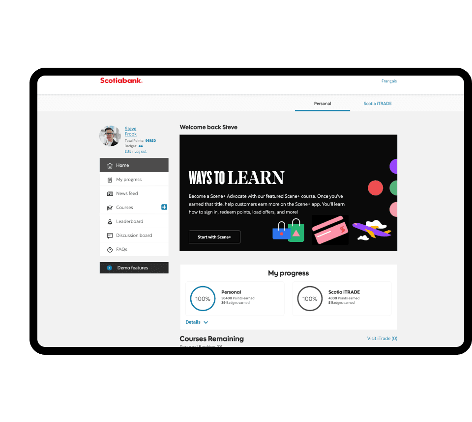
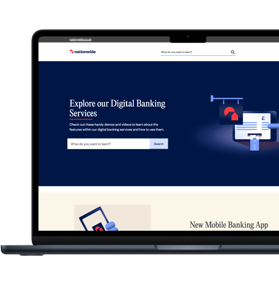
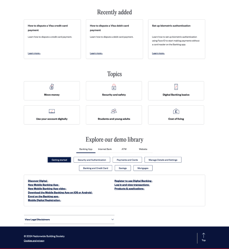
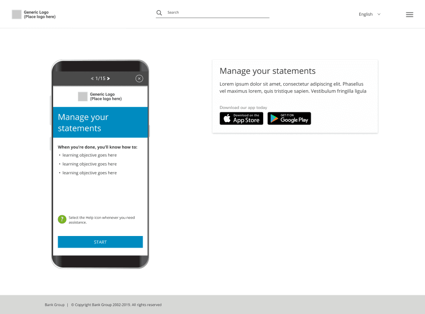
At Horizn, I was assigned the redesign of Customer Direct, a platform tailored for banks and financial institutions, offering ‘How to?’ modules as a self-serve solution. Customer Direct serves as a versatile hub, adaptable to various branding guidelines, empowering banks to educate users and stay updated on digital banking trends.
The aim was to improve engagement rates and user returns by auditing and enhancing the existing product, ensuring that it effectively serves its purpose of effective digital banking learning experience. Working collaboratively across design, product, and development teams, we aimed to maintain storytelling elements while ensuring a seamless navigation experience.
Challenge
The existing platform was not effective in intuitive user flow and also needed optimization for conversions. Users fail to accomplish their goals in the demo journey.
Most users were unable to navigate the modules and preferred agent guides. The existing product lacked intuitive design to guide the user through the demos, the platform was also only used when there was a query or a problem but to maximize the opportunity when the user is in the platform, to keep them engaged we need to come up with solutions to help them to stay informed about on going updates to digital banking.
Description
Branding
A flexible layout to be able to apply multiple branding.
Scalability
Fit content of different services of each sector.
Accessibility
The platform must comply with WCAG stadards.
Informative
Push new features and methods of digital.
Research & insights
Gaining a comprehensive understanding of users who are troubled with the experience due to technological inexperience
Although I wasn’t directly responsible for the user research of the project due to a dedicated research team of each client, I wanted to include a summary of the conclusions shared from personal research and research conducted by our client’s research team.
We looked at the usage data and metrics as it allowed us to look at trends, understand patterns and get an idea of how the product was landing with customers especially with a specific group of people who are not very tech savvy. This data helped us formulate hypothesis and plan our initial design phase. To better visualise I created 2 persona’s of most impacted user group.
Ideation
Make the platform more engaging and host more content by including section based content hierarchy structure and demos with minimal content and more control
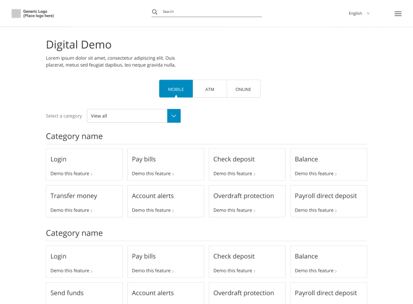
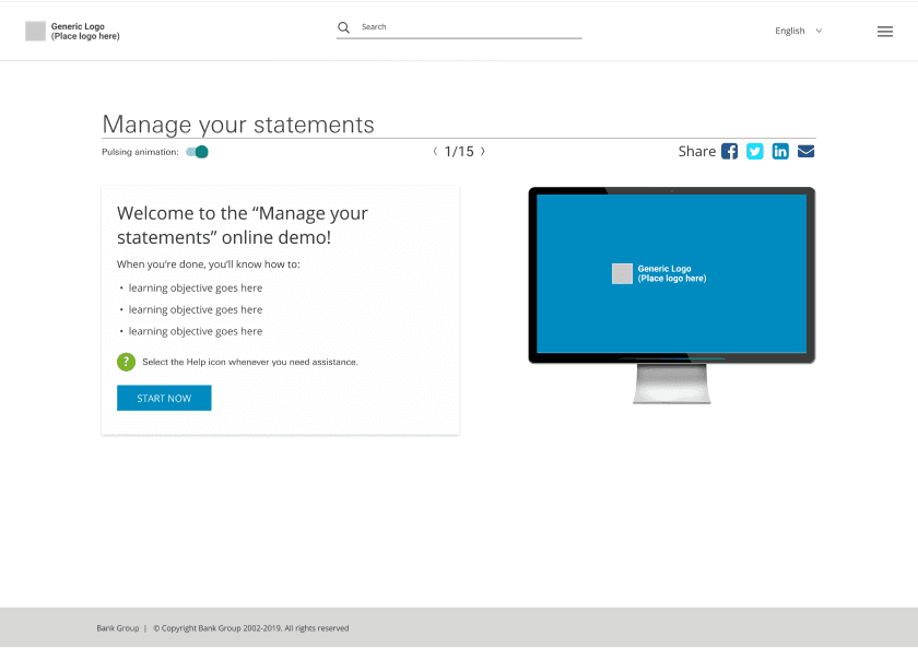
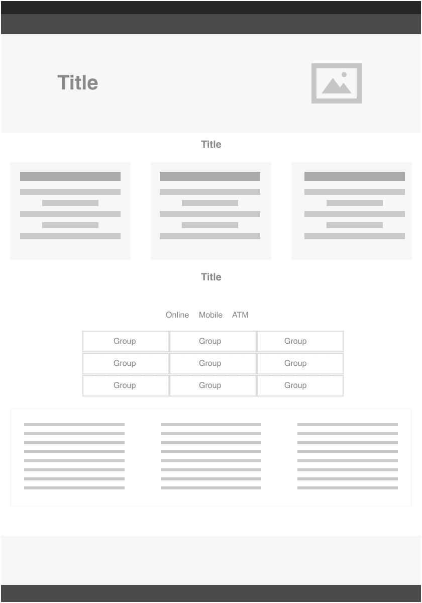
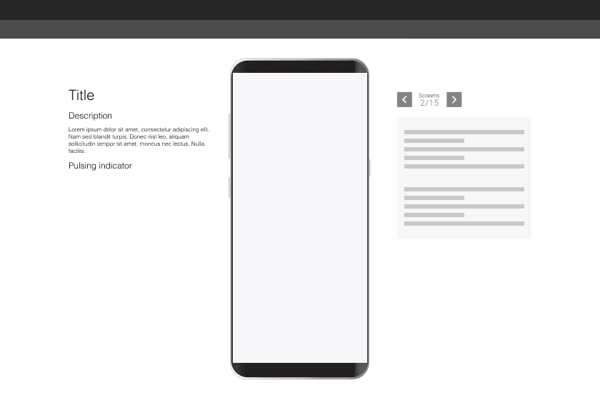
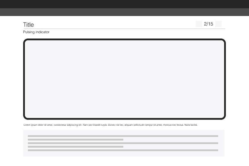
After evaluating the data, I moved forward with wireframes and created layouts with the solutions formulated based on problems gathered in research. Them being, huge content that keeps changing with each step and no instructions on how to go through the demo.
These wireframes were used to gain alignment between business stakeholders, the board and senior leadership. It also allowed me to present a vision to the organization and receive feedback from my colleagues on the direction we were thinking of taking the project.

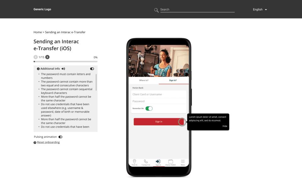
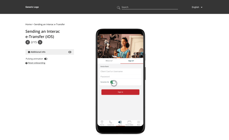
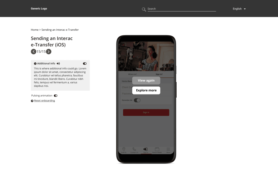
Initial designs
Clear indicators and audio support to help users better interact with the product and keeping the supporting content hidden for better focus
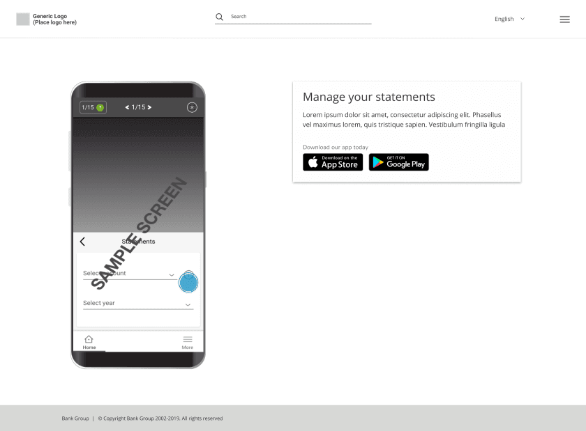
To make it more clear to the user on how to navigate the demo we added indicators and audio support, provided the user have the option to control them.
Tooltips were included as part of the indicators to guide user at every step. Aligning the demo to the center on the platform is to bring the attention to one place and take it from there.
Feedback & iterations
Unexpected results from user testing had the product go through readjustments
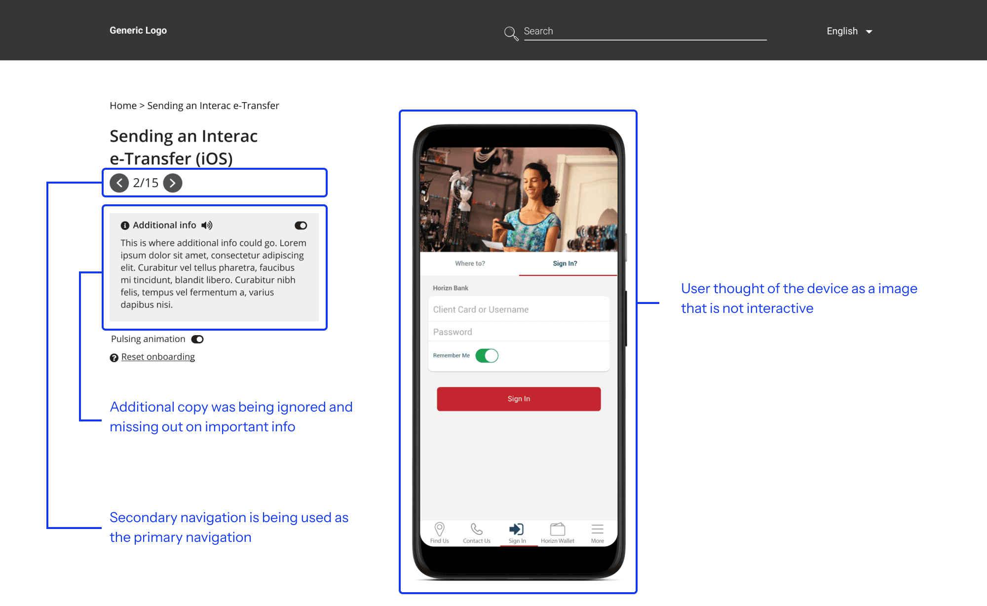
The homepage for content has been approved by majority of clients with minor corrections but we had 3 recurring behaviours with the demo
1. Users couldn’t differentiate the device from the background and weren’t sure on how to get started on the demo.
2. Users who did engage with the demo are using the alternate navigations instead of primary navigation method which was the meant to be a more educating experience.
3. Users ignored the additional copy on the left and were just following the tooltips.
Final designs & Results
A minimal, easy to navigate platform to learn and stay updated with evolving digital banking
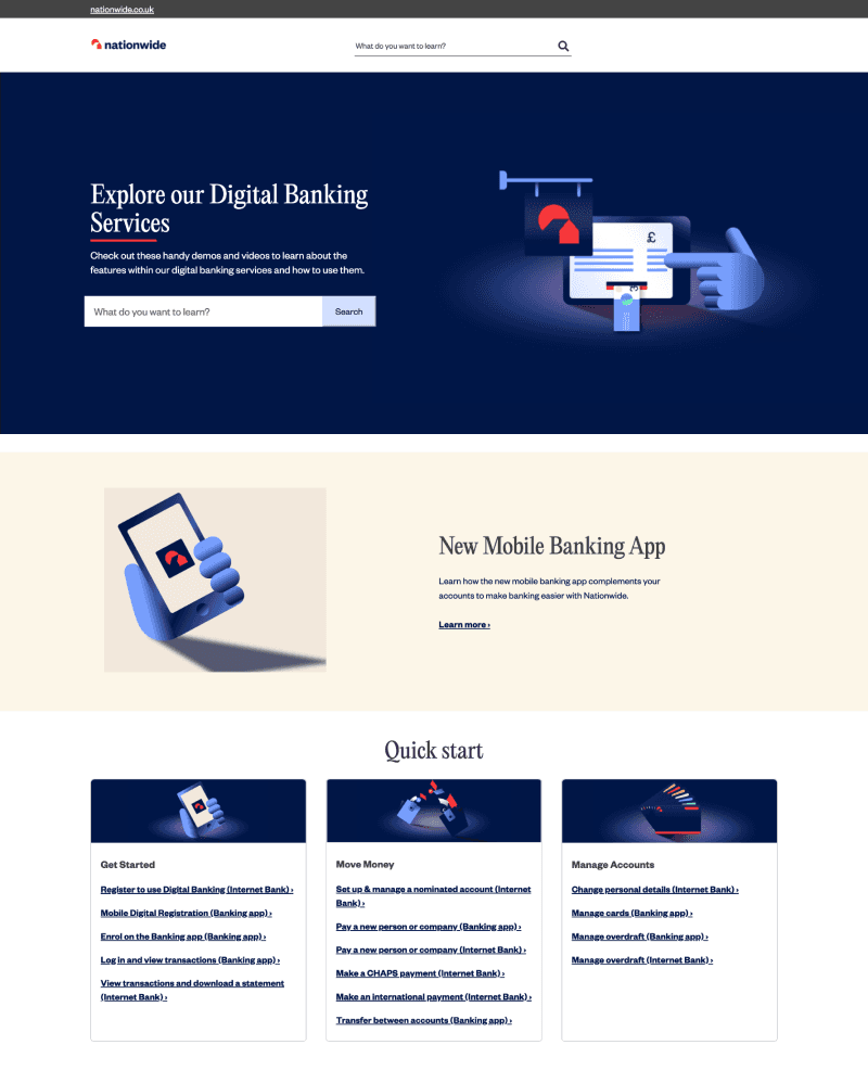
To be able to induce loads of content and to not make the user overwhelmed by it, I designed a priority only layout that reduces decision making difficulty with the user. Breaking down the content into different categories.
And to deal with the above mentioned concerns, we got rid of the additional copy section and incorporated that into the tooltips along with more copy as popups when required. We also gave the device a 3D perspective at the intro to let the user know which part is interactive.
The outcome is a modular layout, simplifying the integration of new content as demand emerges. To achieve our goal of facilitating a easy learning, we incorporated subtle motions and guiding tooltips that can be enabled with just a click. This approach significantly increased adoption rate.
Live: Nationwide
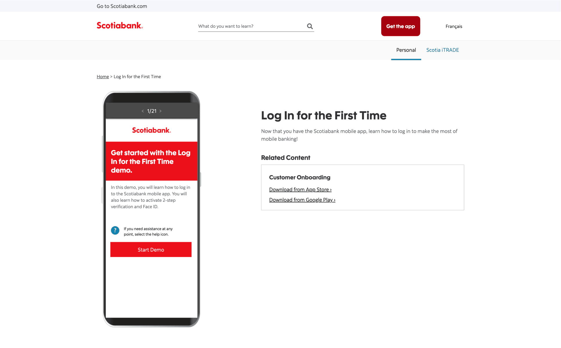

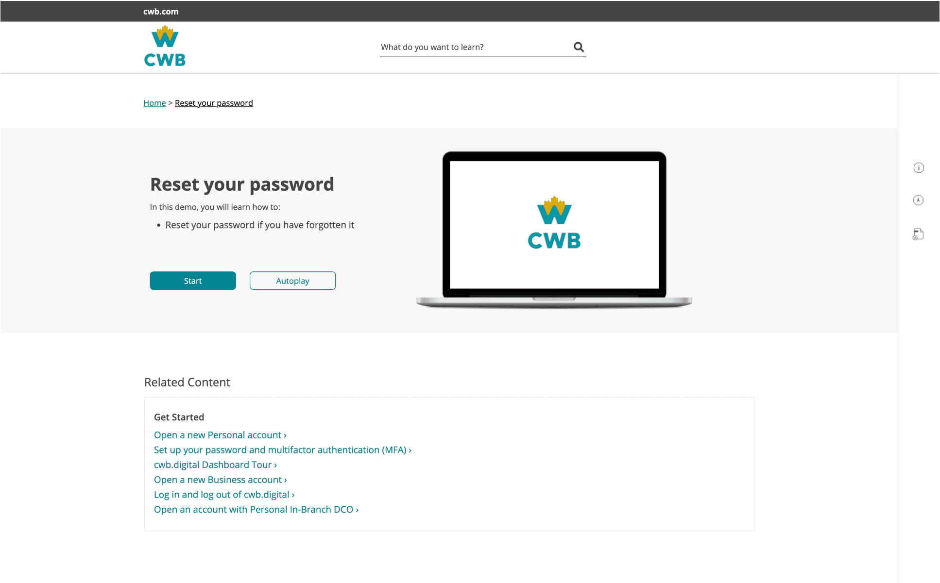
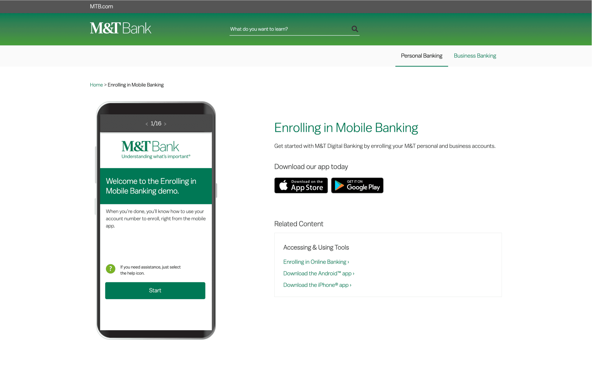
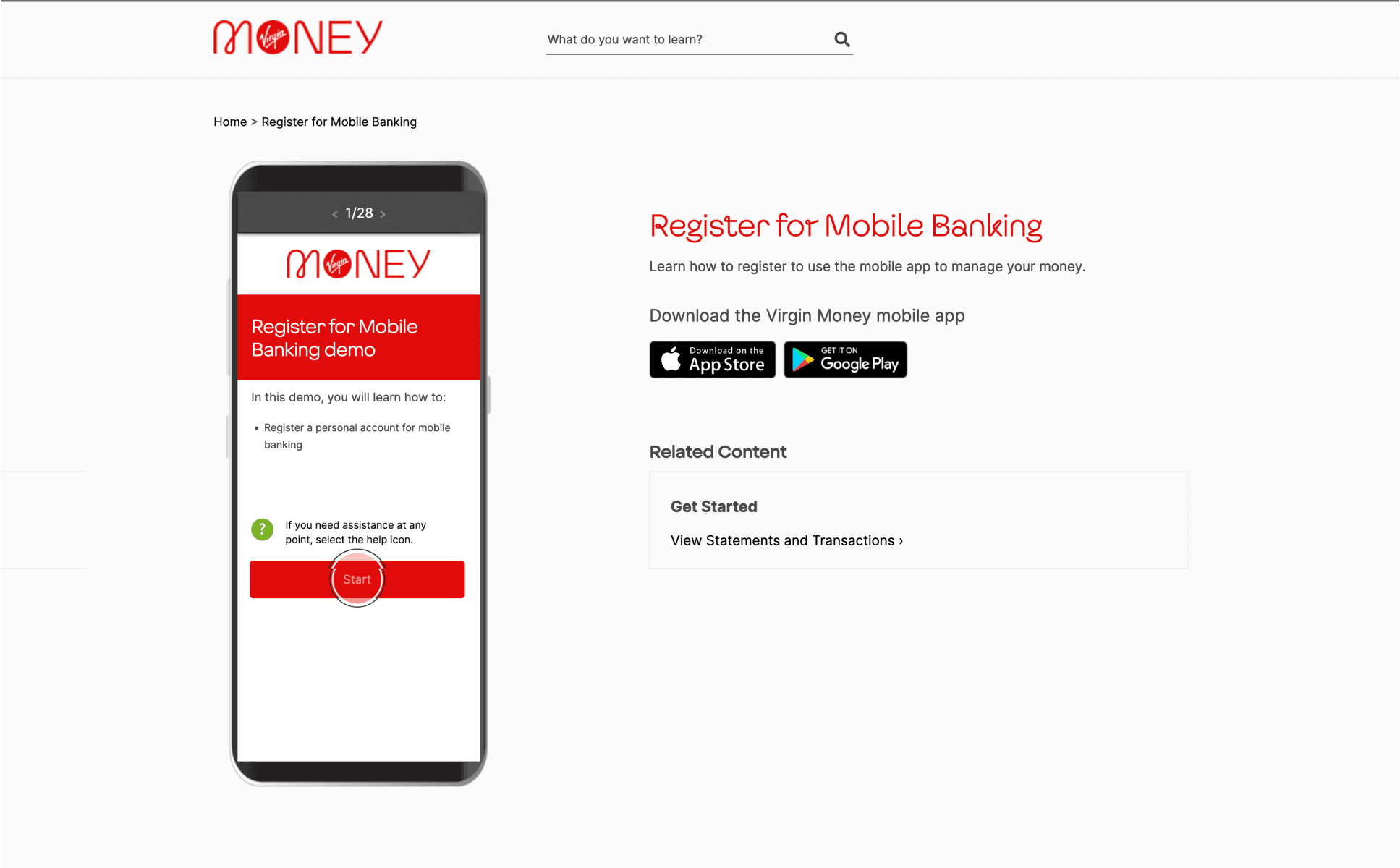
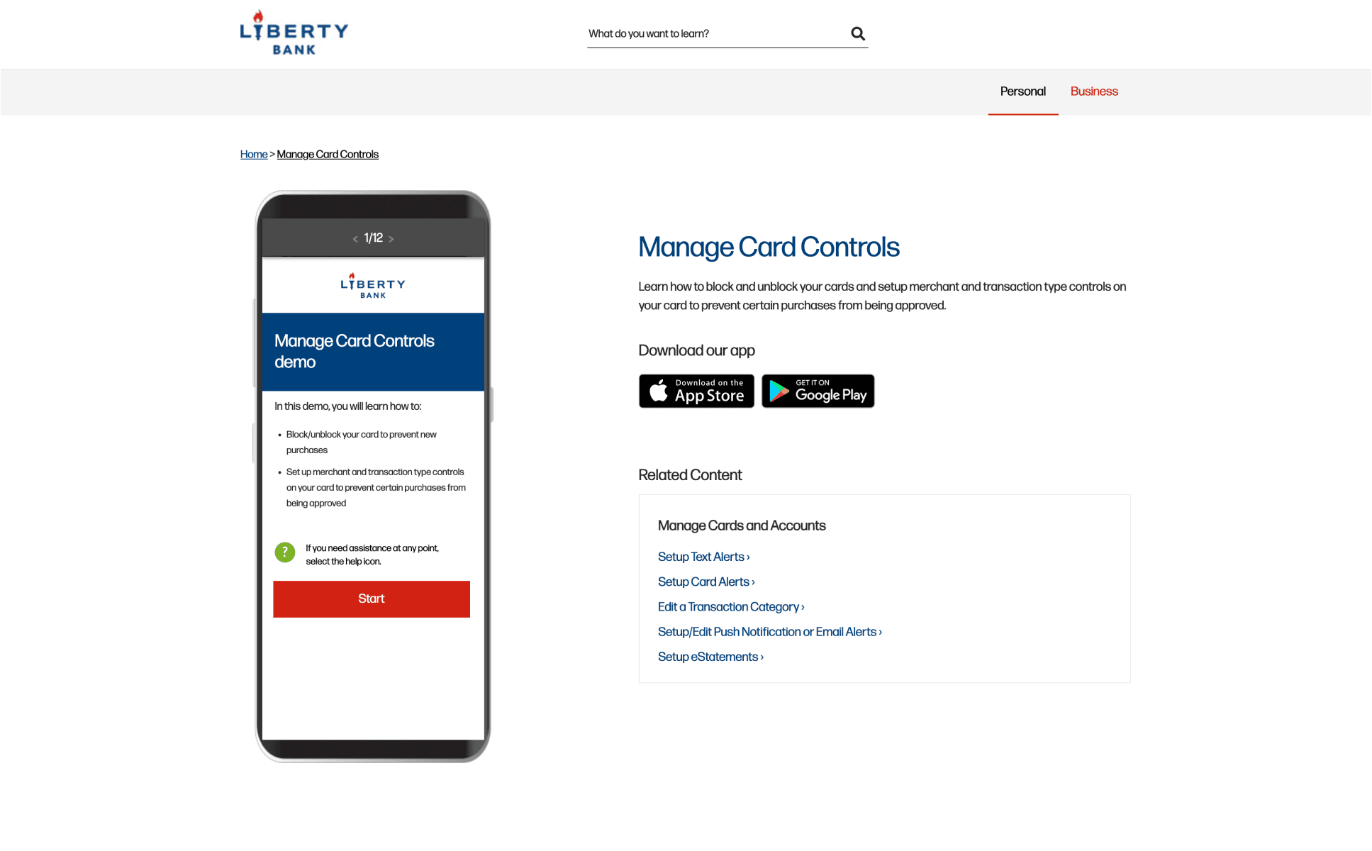
Achieving impactful results with high user engagement and reduced agent efforts.
+33%
Increase in customer online logins
+85%
Success in user engagement with the modules
+235%
Increase in customer
mobile banking logins
Learnings
Lessons and Improvements
It’s a huge privilege to work on a product that will cater to millions of users will get to see and experience. Working with different teams and having constrains helped me learn more time management. If there was one thing I could’ve done to improve is to onboard existing and new users to the NEW platform and include more engaging elements of motion and gather feedback on the improvements. Due to client obligation we were not hands on in the research process though we got the data, I believe being more involved in research would give me a even stronger understanding of the users.